
Back-to-Top Button
=> Details see Back-to-Top Button for Hugo Stack theme
ToC for mobile
My concept is:
- When clicking the TOC button, the menu slides up from the bottom.
- Clicking on any heading, outside the menu, or the close icon will close the menu.
- When scrolling down, the button hides; when scrolling up for a certain distance, the button reappears.
HTML part
The path is layouts/partials/footer/custom.html
Click to show code
<!-- ToC button -->
<div id="toc-button" class="toc-btn">
  <button>
    <svg xmlns="http://www.w3.org/2000/svg" width="24" height="24" viewBox="0 0 24 24" fill="none" stroke="currentColor"
      stroke-width="2" stroke-linecap="round" stroke-linejoin="round" xmlns="http://www.w3.org/2000/svg">
      <path
        d="M8 6L21 6.00078M8 12L21 12.0008M8 18L21 18.0007M3 6.5H4V5.5H3V6.5ZM3 12.5H4V11.5H3V12.5ZM3 18.5H4V17.5H3V18.5Z" />
    </svg>
  </button>
</div>

<!-- ToC drawer -->
<div id="toc-drawer" class="toc-drawer">
  <div class="drawer-header">
    <!-- icon of TOC -->
    {{ partial "helper/icon" "hash" }}
    <h2> TABLE OF CONTENT</h2>
    <button id="close-drawer" class="close-btn">✕</button>
  </div>
  <div class="widget--toc">
    <!-- Use hugo generated ToC -->
    {{ .TableOfContents }}
  </div>
</div

<!-- ToC Overlay -->
<div id="drawer-overlay" class="overlay"></div>
First, we can reuse the Back-to-Top button HTML part, then the sliding-up menu and the remaining shadow overlay. Here we can refer to the existing code for guidance partials/widget/toc.html
CSS part
The path is assets/scss/partials/footer.scss
Click to show code
/* Buttons CSS */
.button-float {
    padding: 8px;
    border: none;
    border-radius: 8px;
    background-color: var(--button-float-bg);
    box-shadow: 0 3px 5px var(--button-float-shadow);
    cursor: pointer;
    width: 36px;
    height: 36px;
    display: flex;
    justify-content: center;
    align-items: center;
    transition: all 0.3s ease;

    &:hover {
        background-color: var(--button-float-bg-hover);
        box-shadow: 0 5px 8px var(--button-float-shadow-hover);
        transform: translateY(-2px);
    }

    svg {
        width: 16px;
        height: 16px;
        stroke: var(--button-float-arrow);
        transition: stroke 0.3s ease;
    }

    &:hover svg {
        stroke: var(--button-float-arrow);
    }
}

/* Back-to-top button */
.back-to-top {
    position: fixed;
    bottom: 20px;
    right: 20px;
    z-index: 1000;
    display: none;

    button {
        @extend .button-float;
    }
}

/* ToC button */
.toc-btn {
    position: fixed;
    bottom: 60px;
    right: 20px;
    z-index: 1001;
    display: none;

    @media (max-width: 1023px) {
        display: block;
    }

    body.homepage &,
    body.template-archives &,
    body.template-search & {
        display: none !important;
    }

    button {
        @extend .button-float;
    }
}

/* ToC drawer */
.toc-drawer {
    position: fixed;
    bottom: 0;
    left: 0;
    width: 100%;
    height: 60%;
    background: var(--button-float-bg);
    border-radius: 12px 12px 0 0;
    transform: translateY(100%);
    transition: transform 0.3s ease-in-out;
    z-index: 1001;
    display: flex;
    flex-direction: column;

    .widget--toc {
        border-radius: 0px;
        box-shadow: none;
    }
}

.drawer-header {
    display: flex;
    justify-content: space-between;
    align-items: center;
    padding: 14px;
    border-radius: 12px 12px 0 0;
    border-bottom: 2px dashed var(--body-background);
    font-size: 14px;
    font-weight: bold;
    color: var(--button-float-arrow);
    background: var(--button-float-bg-hover);

    h2 {
        margin: 10px 0;
    }
}

.close-btn {
    background: none;
    border: none;
    font-size: 20px;
    cursor: pointer;
    color: var(--button-float-arrow);
}

/* ToC background overlay */
.overlay {
    position: fixed;
    top: 0;
    left: 0;
    width: 100%;
    height: 100%;
    background: rgba(0, 0, 0, 0.3);
    backdrop-filter: blur(5px);
    z-index: 1000;
    display: none;
}
I merged the styles of back-to-top and toc-button to reduce code duplication. Additionally, I used the existing widget--toc style and adjusted certain properties individually to ensure a smooth display.
JS part
The same path for back-to-top and I merged the event listeners and actions.
Click to show code
<script>
    document.addEventListener("DOMContentLoaded", () => {
        const backToTop = document.getElementById("back-to-top");
        const tocButton = document.getElementById("toc-button");
        let lastScrollY = window.scrollY;
        let lastShowY = window.scrollY; // Stores last Y position when buttons were shown

        window.addEventListener("scroll", () => {
            let currentScrollY = window.scrollY;

            if (currentScrollY < lastScrollY) { // User is scrolling up
                if (lastShowY - currentScrollY > 50) { // Ensure user scrolled up 50px
                    tocButton.style.display = "";
                    // Ensure back to top display only after 400px
                    if (window.scrollY > 400) {
                        backToTop.style.display = "block";
                    }
                    // Adjust TOC button position if both are visible
                    // if (backToTop.style.display != "none" && tocButton.style.display != "none") {
                    //     backToTop.style.bottom = "60px";
                    //     tocButton.style.bottom = "20px";
                    // // }
                }
            } else {
                // User is scrolling down, reset reference position
                lastShowY = currentScrollY;
                backToTop.style.display = "none";
                tocButton.style.display = "none";
            }

            lastScrollY = currentScrollY; // Update last scroll position
        });

        // Back to Top Click Event
        backToTop.addEventListener("click", function () {
            window.scrollTo({ top: 0, behavior: "smooth" });
        });
    });

    // Toc Drawer open and close
    document.addEventListener("DOMContentLoaded", () => {
        const tocButton = document.getElementById("toc-button");
        const tocDrawer = document.getElementById("toc-drawer");
        const drawerOverlay = document.getElementById("drawer-overlay");
        const closeDrawer = document.getElementById("close-drawer");
        const tocLinks = document.querySelectorAll("#toc-drawer li a"); // Get all TOC links


        function openTOC() {
            tocDrawer.style.transform = "translateY(0)";
            drawerOverlay.style.display = "block";
        }

        function closeTOC() {
            tocDrawer.style.transform = "translateY(100%)";
            drawerOverlay.style.display = "none";
        }

        tocButton.addEventListener("click", openTOC);

        closeDrawer.addEventListener("click", closeTOC);
        drawerOverlay.addEventListener("click", closeTOC);

        tocLinks.forEach(link => {
            link.addEventListener("click", closeTOC);
        });
    });
</script>
Some issues
❌ All Pages Display ToC
After completing the three parts, I realized that the ToC button appeared on all pages, not just post pages (this wasn’t an issue with the back button). So, I added extra CSS rules:
.toc-btn {
    ...
    body.homepage &,
    body.template-archives &,
    body.template-search & {
        display: none !important;
    }
}
Both archives and search have specific class names, but the homepage does not. Therefore, we need to modify layouts/_default/baseof.html to address this:
-   <body class="{{ block `body-class` . }}{{ end }}">
+   <body class="{{ block `body-class` . }}homepage{{ end }}">
❌ Duplicate ToC on Desktop
The final modification was to remove the ToC button on desktop. I noticed some approaches replaced the sidebar ToC entirely, but I prefer the intuitive visibility of the sidebar.
Initially, I considered using JavaScript to check if a ToC widget was already present before deciding whether to show the ToC button (similar to the logic for hiding the button when scrolling down). However, this seemed unnecessarily complicated. Instead, I opted for CSS, since the ToC widget disappears when the screen width shrinks.
After searching for a while, I only found the right-sidebar breakpoint change, so I manually input the numbers instead:
.toc-btn {
    ...
    @media (max-width: 1023px) {
        display: block;
    }
}
❓ Timing of Showing & Hiding
Currently, the ToC button is set to always display by default, meaning it appears immediately when entering an article. This has both pros and cons: it helps preview the article structure but can feel intrusive. The opposite setting also has trade-offs.
Anyway, since everything works, I’ll leave it as is for now.
Comment System
My first choice was Remark42 (because its name includes the answer to the universe 🙄), but after struggling with it for a while, I found it inconvenient to manage. So, I switched to Twikoo .
Following the official documentation step by step worked fine (though I ran into issues with MongoDB URL configuration, version locks, and other random problems, which I somehow resolved but forgot exactly how… I’ll deal with it again if needed).
Unexpectedly, GitHub preserved my somehow solved but don’t remember how solution:
[comments.twikoo]
envId = "my-envID"
region = "my-region"
- path = "/twikoo"
+ path = "window.location.pathname"
lang = "en"
As for version control, I simply searched for the current version number and updated it in the relevant places.
Comment Stickers
Reference: Gigigatgat: Twikoo Tutorial
The moment I saw the default stickers, I nearly fainted. I immediately searched for alternatives and replaced them with Blobcat, ensuring some sanity.
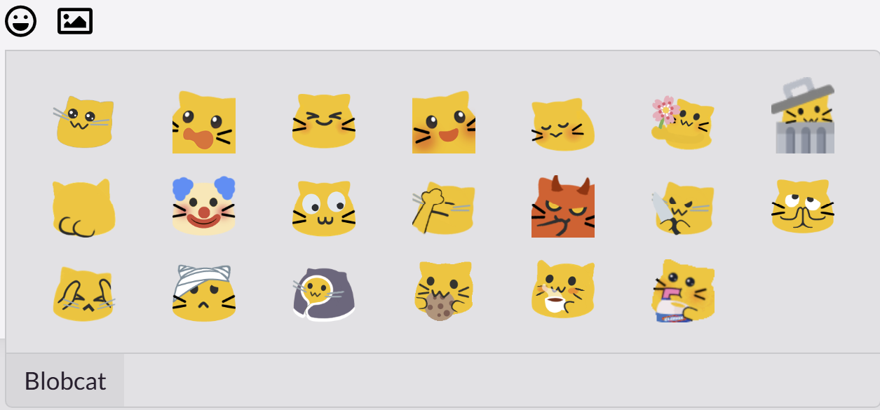
Cute blobcats
External Link Icons
Reference: Third Shire: Hugo Stack Renovation
I Added an icon to indicate ’leaving this site’ for external links. At the same time, all hyperlinks are now set with rel="noopener noreferrer nofollow".
Word Count
Update cofig
The first step is to ensure that CJK (Chinese, Japanese, Korean) character support is enabled in config.toml, i.e.: hasCJKLanguage = true
Additionally, I added this line wordCount = true in params.toml. This makes it easier to toggle later. (Though months later, I somehow got this mixed up with readingTime, and I still have no idea why… 🤷)
Add Code
Insert the following code in /layouts/partials/article/components/details.html:
Click to show code
{{ $showWordCount := .Params.wordCount | default (.Site.Params.article.wordCount) }}
...
{{ if $showWordCount}}
    <div>
        {{ partial "helper/icon" "word-count" }}
        <time class="article-time--reading">
            {{ T "article.wordCount" .WordCount }}
        </time>
    </div>
{{ end }}
Since the wordCount is essentially copied from readingTime, it uses the same style so there is no need to add customization for it.
Codeblock Style
Reference: Naive Koala: Stack Modify
I made some changes, mainly:
- If no specific language is provided, it defaults to
TEXTinstead of the usualFALLBACK. - Added a toolbar for better styling, as I really dislike the floating copy button.
Code is updated in the existing main.ts:
Click to show code
        ...
        /**
         * Add copy button to code block
        */
        const highlights = document.querySelectorAll('.article-content div.highlight');
        const copyText = '✂ Copy';
        const copiedText = '✔ Copied';

        highlights.forEach(highlight => {
            const codeBlock = highlight.querySelector('code[data-lang]');
            // console.log("Raw data-lang:", codeBlock?.getAttribute('data-lang'));
            if (!codeBlock) return;

            // Get language
            const rawLang = codeBlock.getAttribute('data-lang');
            const lang = (rawLang === "fallback" || !rawLang) ? "TEXT" : rawLang.toUpperCase();
            // console.log("Final language:", lang);
            const langTag = createButton(lang, 'languageTagButton');

            // New copy button
            const copyButton = createButton(copyText, 'copyCodeButton');

            // Create toolbar
            const toolbar = document.createElement('div');
            toolbar.classList.add('toolbar');
            toolbar.appendChild(langTag);
            toolbar.appendChild(copyButton);

            highlight.insertBefore(toolbar, highlight.firstChild);

            // Copy function
            copyButton.addEventListener('click', () => {
                navigator.clipboard.writeText(codeBlock.textContent)
                    .then(() => {
                        copyButton.textContent = copiedText;

                        setTimeout(() => {
                            copyButton.textContent = copyText;
                        }, 1000);
                    })
                    .catch(err => {
                        alert(err);
                        console.error('Copy failed:', err);
                    });
            });
        });

        // helper function
        function createButton(text, className) {
            const button = document.createElement('button');
            button.innerHTML = text;
            button.classList.add(className);
            return button;
        }

        new StackColorScheme(document.getElementById('dark-mode-toggle'));
Additionally, I modified the highlight section in assets/scss/partials/layout/article.scss.
Click to show code
    .highlight {
        max-width: 102% !important;
        padding: 0px;
        position: relative;
        border-radius: 8px;
        margin-left: -8px !important;
        margin-right: -2px;
        box-shadow: var(--shadow-l1) !important;

        // keep Codeblocks LTR
        [dir="rtl"] & {
            direction: ltr;
        }

        pre {
            margin: initial;
            padding: 15px 25px;
            margin: 0;
            width: auto;
            border-radius: 0 0 8px 8px;
        }

        .toolbar {
            position: relative;
            width: 100%;
            height: 30px;

            background-color: var(--code-toolbar-color);
            z-index: 10;
            display: flex;
            justify-content: space-between;
            align-items: center;
            padding: 6px 16px;

            border-top-left-radius: 8px;
            border-top-right-radius: 8px;

            .languageTagButton {
                background: none;
                border: none;
                font-size: 12px;
                font-family: var(--code-font-family);
                color: var(--code-button-color);
                cursor: default;
            }

            .copyCodeButton {
                background: none;
                border: none;
                color: var(--code-button-color);
                font-size: 12px;
                cursor: pointer;
            }
        }
    }
Overall, there seem to be way too many styles for code blocks which can be a bit overwhelming. But as long as it works, that’s good enough. (ˉ﹃ˉ)
Multilingual Setup
Honestly, I don’t fully understand Hugo’s multilingual structure. From my understanding, Hugo sorts content as Site → Language → Page, whereas my preference would be Site → Page → Language. This way, the article is the primary entity, with multiple languages as variations.
With Hugo’s structure, each language exists as an independent site, meaning different language versions have separate homepages. This creates issues when trying to track unique articles. For example, if I want to write an article in Spanish instead of Chinese, I won’t be able to see it unless I explicitly create a Spanish site.
I spent a lot of time trying to make unique URLs work, but it got overly complicated and didn’t align with Hugo’s simple approach. So in the end, I gave up and just used the official method (Multilingual Mode) .
My stubbornness made me want the Chinese homepage to also display English (to maintain homepage consistency). However, this can’t be done via config. One as long as it works approach is to modify i18n settings and set the target language to match English instead. ㄟ( ▔, ▔ )ㄏ
Timeout Setting
After flooding my Paris travel blog with a ton of photos (~150MB), Cloudflare Build threw an error:
Click to check Error
Error: error building site: render: failed to render pages: [...]: execute of template failed: template:
partials/article-list/default.html:3:7: executing "partials/article-list/default.html" at <partial "article/
components/header" .>: error calling partial: partial "article/components/header" timed out after 30s. This is
most likely due to infinite recursion. If this is just a slow template, you can try to increase the 'timeout'
config setting.
Seeing the ruthless most likely due to infinite recursion message, I froze for a moment. Trying to track down where the circular reference occurs is like searching for a needle in a haystack, so I pinned my hopes on other solutions.
Searching through Hugo Stack’s Issues, I found someone with the
same problem
. I tried modifying the config.toml setting:
timeout = 180
…but it had no effect.
Suspecting it might be a Cloudflare issue, I attempted rendering with GitHub Pages, only to run into the exact same problem.
Workarounds that helped (sometimes):
- Splitting long posts into multiple parts—worked occasionally.
- Using batch image compression tools—though the results were often too blurry.
- Building locally and then uploading to another branch, while disabling framework detection on Cloudflare to deploy.
It was all frustrating and unstable. At one point, in a moment of desperation, I recklessly set:
timeout = 100000
…and miraculously, everything worked fine. (._.)
Now, Cloudflare Build takes around 50 seconds, and I have no idea what to do if it gets worse in the future.
I suspect the main issue lies with Hugo Stack’s Picture Gallery feature, which seems to generate multiple resized thumbnails for different media types. This likely consumes a lot of processing time.
I’m not sure whether this will cause more problems later, or how to optimize it, but for now… as long as it works, it’s good enough. 😮💨
Shortcodes
Collapsible Content
Reference:
Example usage:
Collapsible Effect
Here is some Markdown content.
- List item
- Another list item
❗ Note:
- Use block mode shortcode
{% shortcode %}. - If using inline mode shortcode
{< shortcode >}, the summary content won’t be recognized properly. - (In actual use, double curly brackets should be applied.)
Neodb Cards
Reference:
The reference code wasn’t fully compatible with my Hugo version (v0.141.0), leading to errors when applied.
ERROR deprecated: data.GetJSON was deprecated in Hugo v0.123.0 and will be removed in Hugo 0.142.0.
use resources.Get or resources.GetRemote with transform.Unmarshal.
I made some adjustments, particularly separating dbType and dbUuid for more precise lookups.
Click to show code
{{ $dbUrl := .Get 0 }}
{{ $dbApiBase := "https://neodb.social/api" }}
{{ $dbType := "" }}
{{ $dbUuid := "" }}

<!-- Extract item type and UUID -->

{{ if (findRE `^.*neodb\.social\/.*` $dbUrl) }}
    {{ $dbType = replaceRE `.*neodb.social\/([^\/]+)\/.*` "$1" $dbUrl }}
    {{ $dbUuid = replaceRE `.*neodb.social\/[^\/]+\/([^\/]+)` "$1" $dbUrl }}
{{ end }}

<!-- Construct full API URL -->
{{ $fullApiUrl := printf "%s/%s/%s" $dbApiBase $dbType $dbUuid }}

<!-- Fetch data from API -->
{{ $remoteResource := resources.GetRemote $fullApiUrl }}

{{ if $remoteResource }}
    {{ $dbFetch := $remoteResource | transform.Unmarshal }}

...
A cute effect—doesn’t this make reading even more motivating? ┌( ´_ゝ` )┐
Overall, the current functionality and style are pretty close to what I envisioned. Hopefully, I can stay focused on content rather than endlessly tweaking the site itself (._.).
Also, Git is truly amazing—it completely makes up for my bad memory. Definitely worth diving into…